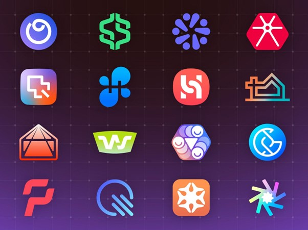
In a world where countless brands compete for attention, your logo isn’t just a design—it’s the face of your business. It’s the first thing customers notice and the visual element they’ll associate with your brand. In the digital age, where impressions are formed in seconds, a logo must do more than look good—communicate, connect, and resonate.
This article has been crafted by the experts at Turbologo, a platform dedicated to helping businesses create standout logos effortlessly. With years of experience in branding and design, we’re here to guide you through designing a logo that makes an impact.
1. Why Your Logo Matters More Than Ever in the Digital Age
The digital landscape has transformed how brands interact with their audiences. Your logo must perform across various digital touchpoints, from social media to websites and apps. It’s not just about looking sharp on a billboard anymore; your logo must be instantly recognizable as a tiny favicon, an app icon, or a social media profile picture.
In this age of scrolling and swiping, attention spans are shorter, and competition is fierce. A stand-out logo can help your brand cut through the noise, creating a lasting impression that builds trust and recognition.
2. Understanding Your Brand’s Core Message
Before diving into design, you must clearly understand what your brand stands for. Ask yourself:
- What values and emotions do I want my brand to convey?
- Who is my target audience, and what resonates with them?
- What makes my brand unique in the market?
A strong logo is rooted in a deep understanding of your brand identity. It’s not just about aesthetics; it’s about telling a story. For example, a tech company might lean into sleek, futuristic designs, while a handmade crafts business could embrace warm, organic elements.
3. The Psychology of Shapes, Colors, and Fonts
Design is as much about psychology as it is about creativity. Each element of your logo—shapes, colors, and fonts—communicates something unique to your audience.
- Shapes: Rounded shapes evoke feelings of community and harmony, while angular shapes suggest strength and professionalism.
- Colors: Every color carries emotional weight. Blue is trustworthy, red is energetic, yellow is cheerful, and green is eco-friendly. Choose wisely to align with your brand’s message.
- Fonts: Typography speaks volumes. Serif fonts feel traditional and elegant, sans-serif fonts are modern and clean, and script fonts are playful or luxurious.
Every design choice should support your brand’s message, creating a cohesive and impactful identity.
4. Balancing Timelessness and Modern Trends

While staying current is essential, chasing fleeting trends can lead to an outdated logo in just a few years. Instead, aim for a design that balances timeless principles with modern sensibilities.
For example, minimalist logos are a modern trend that aligns well with timeless design principles. Think of brands like Apple or Adidas—their logos are clean, simple, and enduring. Avoid overcomplicating your design with trendy elements that might not age well.
5. Making It Memorable: Simplicity Over Complexity
The most iconic logos share one thing in common: simplicity. A complex design might look impressive initially, but it’s harder for people to remember. A strong logo captures attention and sticks in the mind, even after just a glance.
Think of Nike’s swoosh or McDonald’s golden arches—these designs are not just simple but universally recognizable. To achieve memorability, focus on a single, clear concept and avoid overloading your design with unnecessary details.
6. Ensuring Scalability Across Digital Platforms
Your logo must shine on every screen, from smartphones to desktops to massive digital billboards. Scalability is non-negotiable in the digital age.
A detailed or overly intricate design may lose its impact when reduced to a smaller size. Test your logo in various formats and resolutions to ensure it remains sharp and legible, whether displayed as a social media icon or a large banner. Vector files are your best friend for creating scalable designs.
7. Designing for Engagement: How to Connect with Your Audience
Your logo should resonate with your target audience on a deeper level. It’s not just about looking good; it’s about evoking the right emotions and associations.
For instance, a playful logo with bright colors and quirky fonts might appeal to a younger audience. At the same time, a more refined design with neutral tones and elegant typography could attract a professional demographic. The goal is to design a logo that feels familiar yet fresh, making it easier for your audience to connect with your brand.
8. Testing and Refining Your Logo Before the Big Reveal
Before launching your logo, test it with your audience. Gather feedback from colleagues, customers, or focus groups. Consider how people perceive your design and whether it aligns with your brand’s intended message.
Don’t rush the process—refinements are a natural part of good design. Minor spacing, color balance, or typography tweaks can elevate your logo from good to exceptional.
9. Conclusion: Building a Digital-Ready Brand Identity
In the digital age, a logo is more than a design; it’s a strategic asset communicating your brand’s essence in seconds. By understanding your brand, leveraging design psychology, and focusing on simplicity and scalability, you can create a logo that truly stands out.
Ready to make your mark? With Turbologo, you have the tools and expertise to craft a logo that captures your brand’s unique spirit and thrives in the digital world. Start today and let your logo be the cornerstone of a lasting, impactful brand identity.


![Warehouse robotics companies in Europe transforming order fulfillment [Updated]](https://roboticsbiz.com/wp-content/uploads/2019/12/warehouse-robots1-218x150.jpg)

